
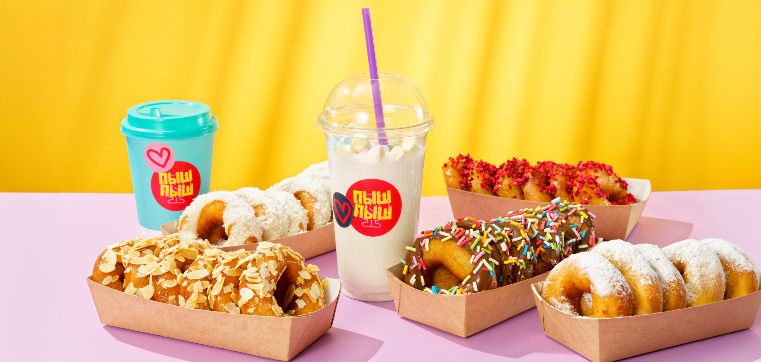
Sweet dreams are made of pishki
Services:
Brand positioning / Naming / Brand identity / Copywriting
Illustration / Print & packaging / Art direction even interior design
Team:
Design, art direction, creative direction: Dmitrii Misanets
Photography: Dmitrii Sobolev / Nadezhda Agodora
About:
Pishkin is a mono product bakery in Moscow. That have a striking variety of donuts, milkshakes, coffee and lemonades. Originaly "Pishki" came from S.Petersburg and they even become a symbol of a city.
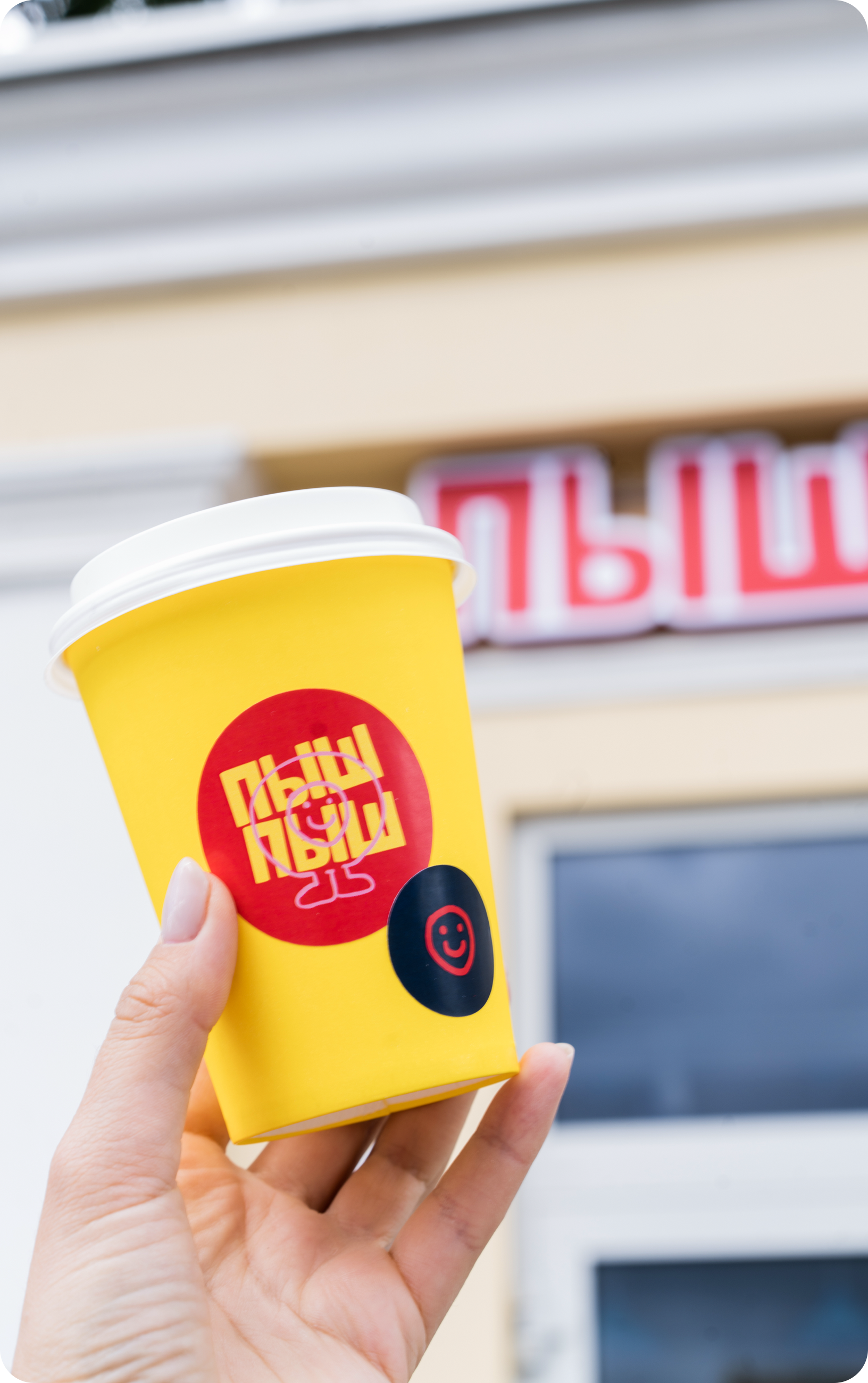
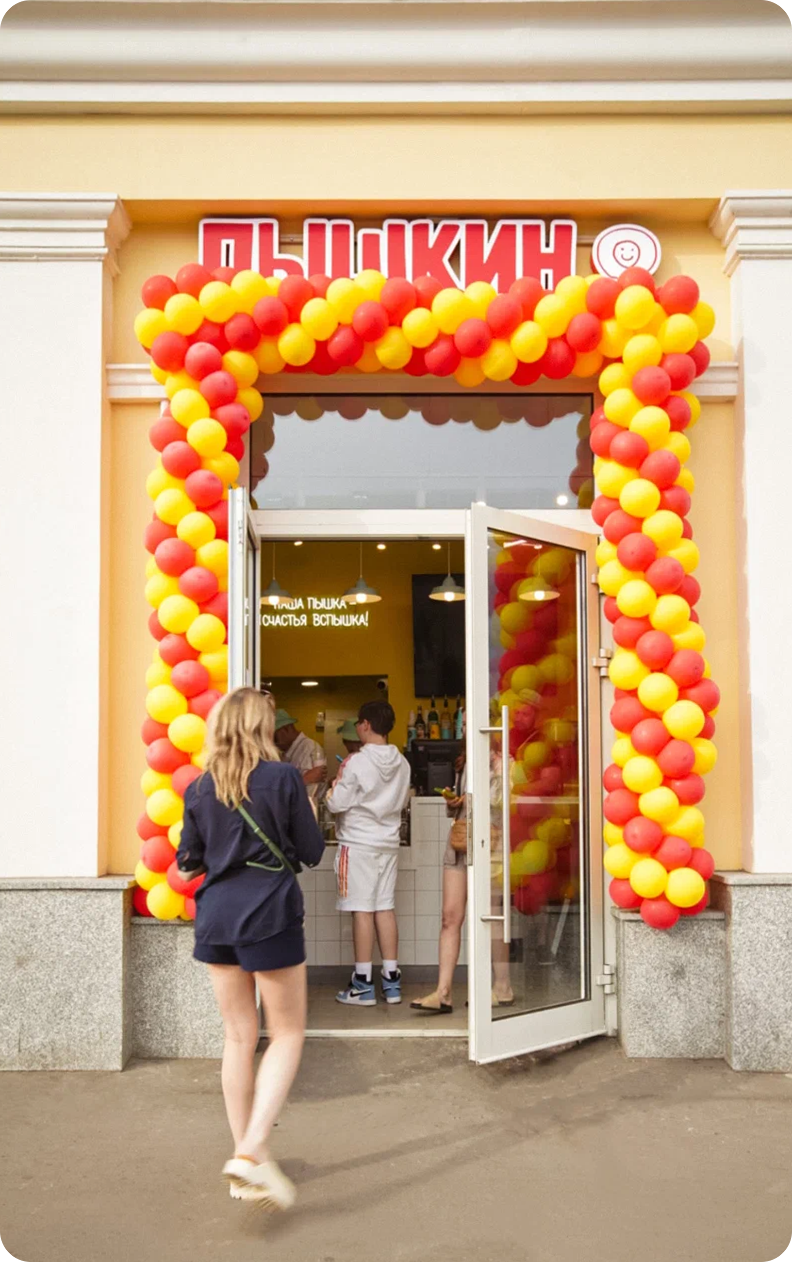
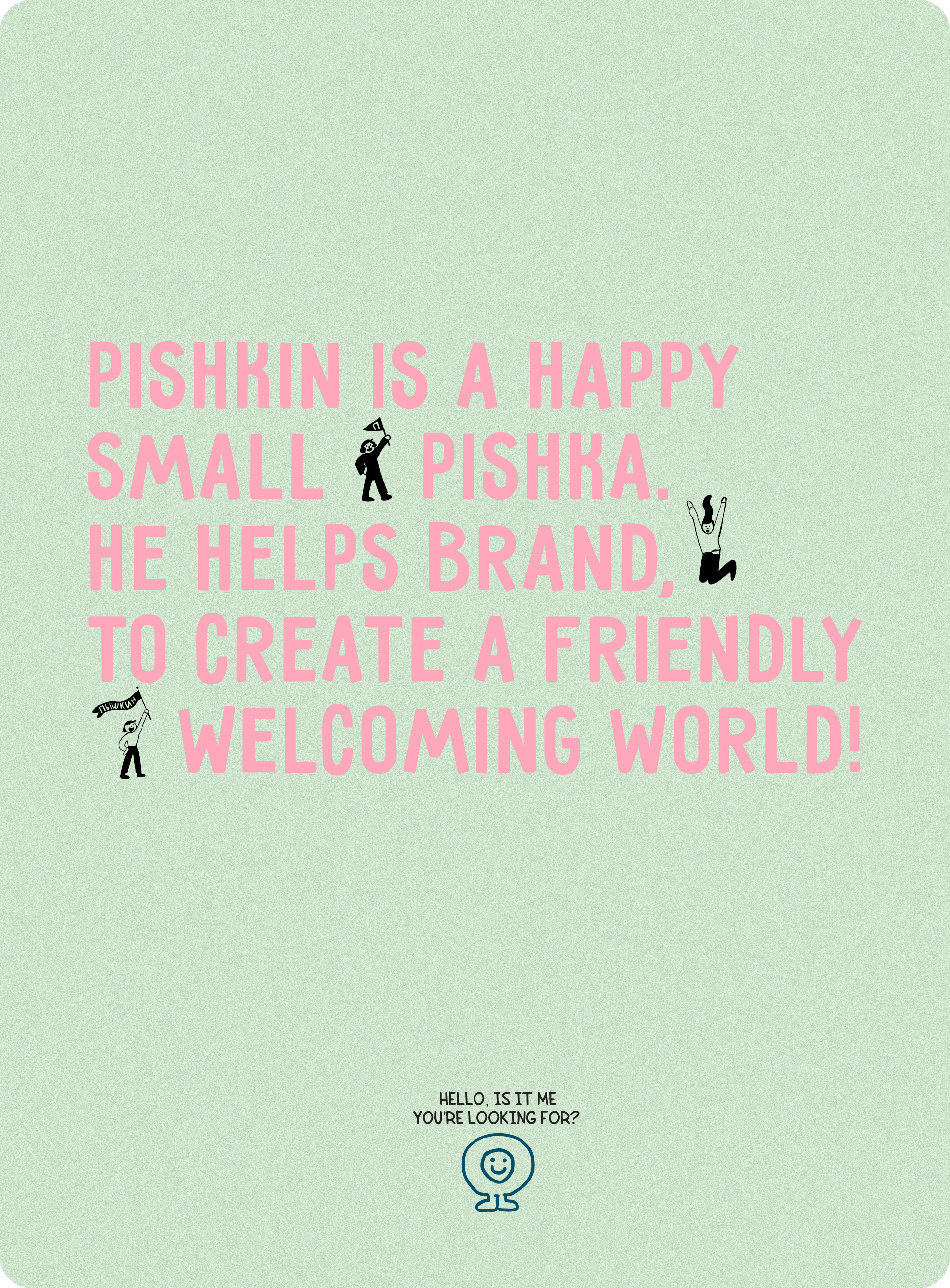
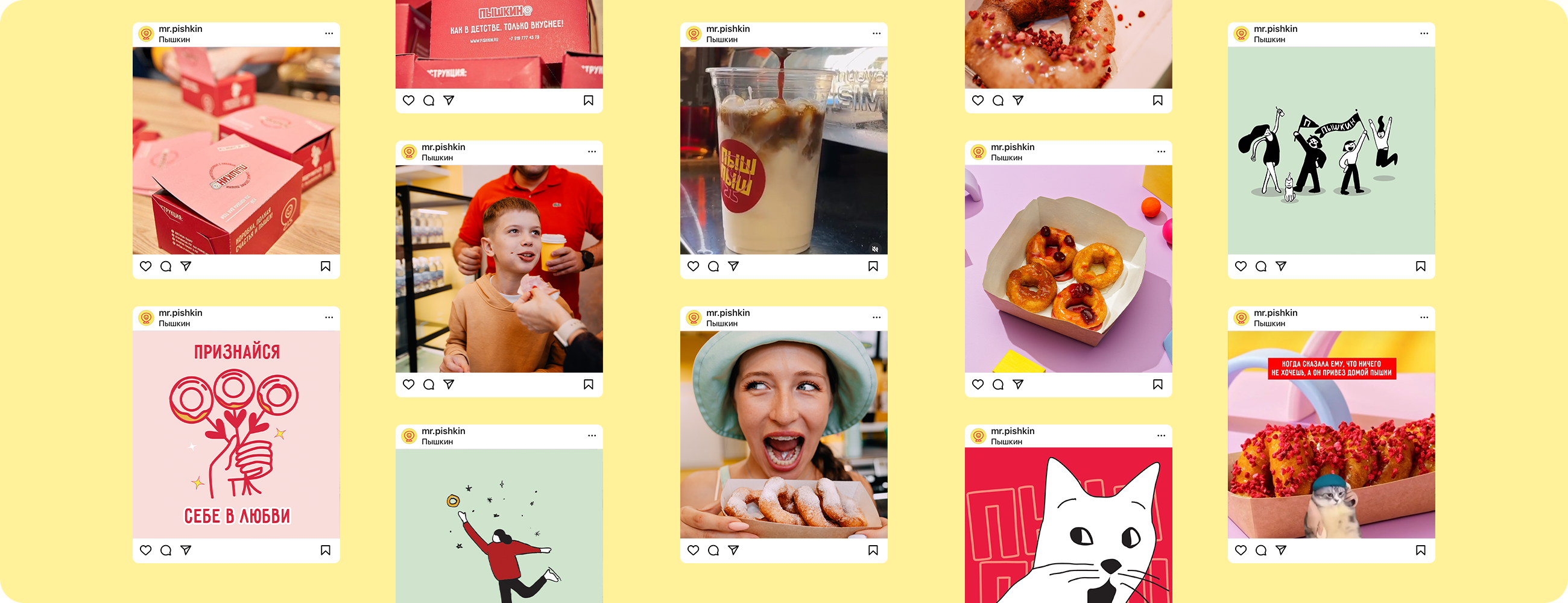
To give brand a destinctive character, we discovered a staright foward speaking name of "Pishkin", wich sound familiar to Pushkin and a name of a product itself. But, it was decided, that it neccesary to shift preception from well-known poet to more friendly and crafty vibe. So we created a funny, simple little mascot and a set of illustration for supporting methaphor in visual identity. The brand evokes a feeling of fun and сheer, creating a friendly space one can lay back in and enjoy the sweet kick.
2022

Cheerfull sweetness and delight
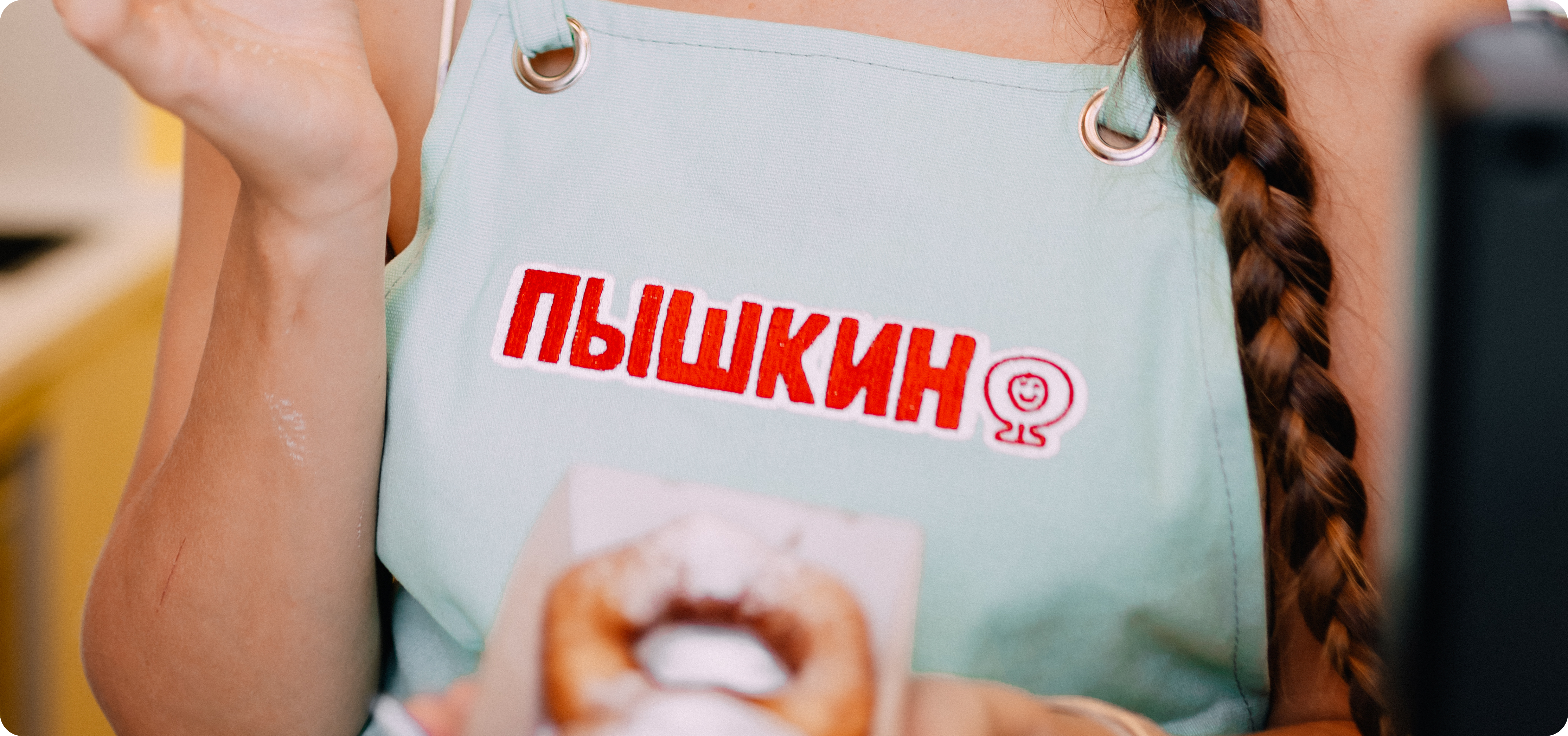
Pishkin's visual identity exudes a refined charm that resonates with customers of all ages. Central to this identity is its distinguished mascot, Pishkin, whose serve as a part of the café's logotype.
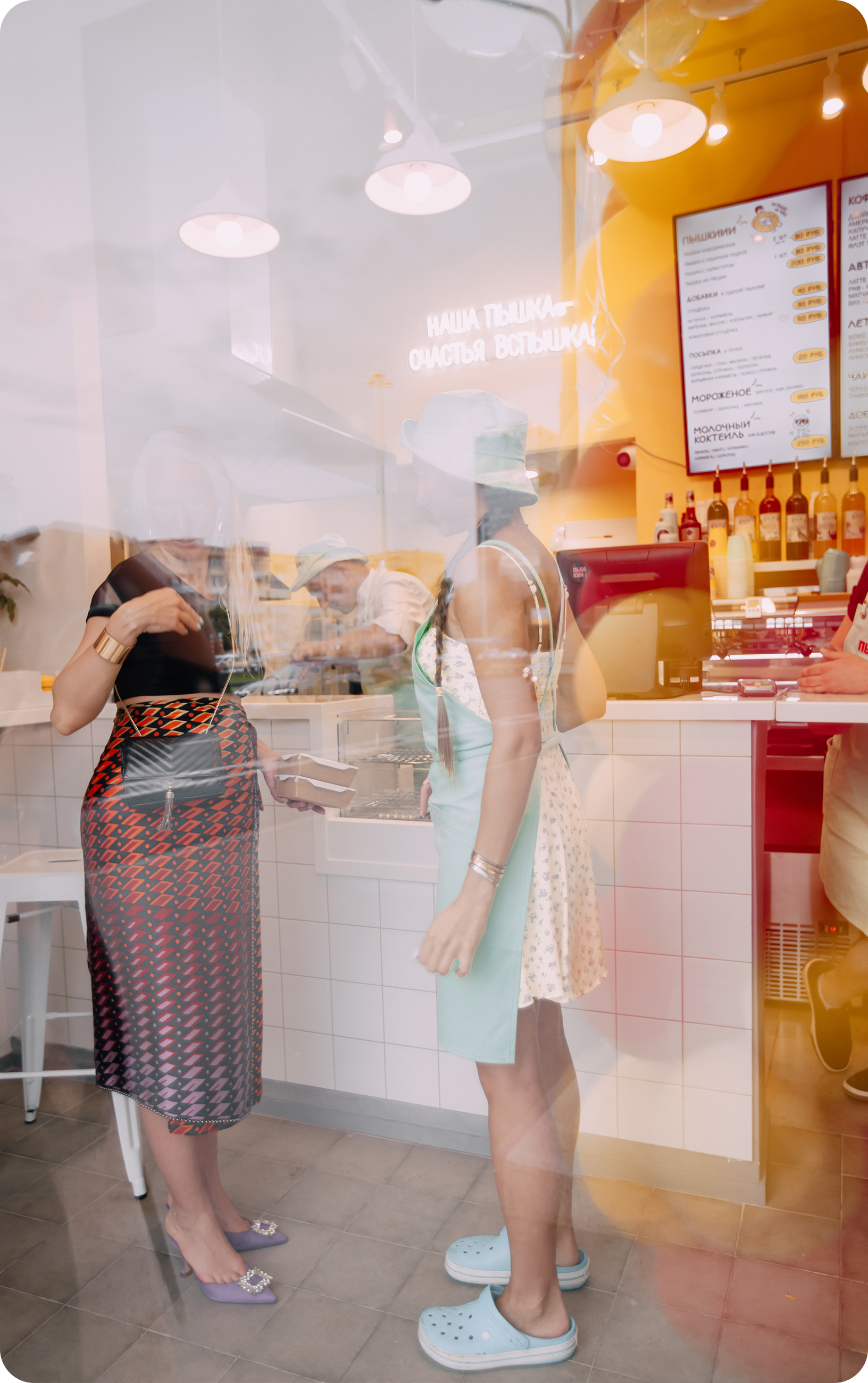
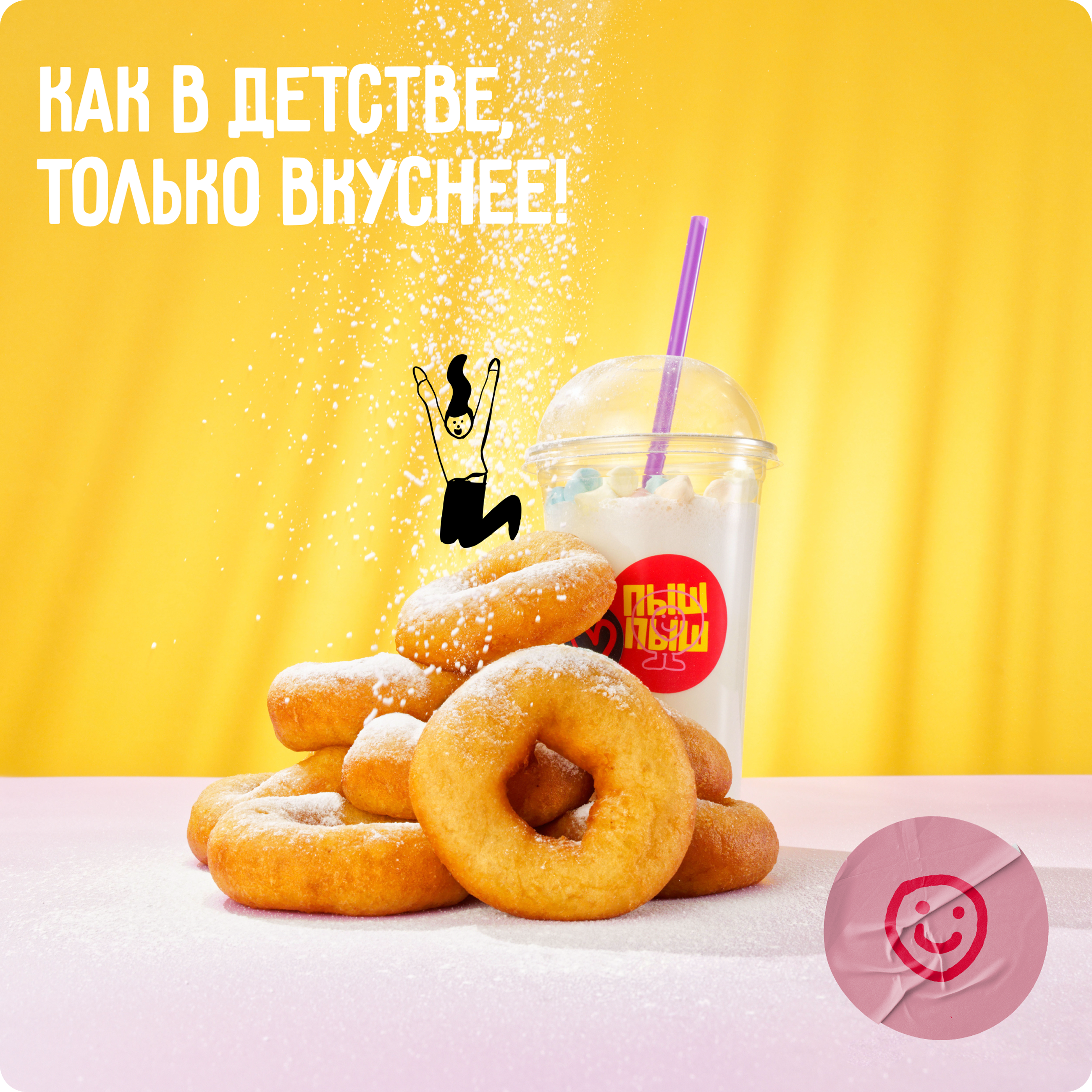
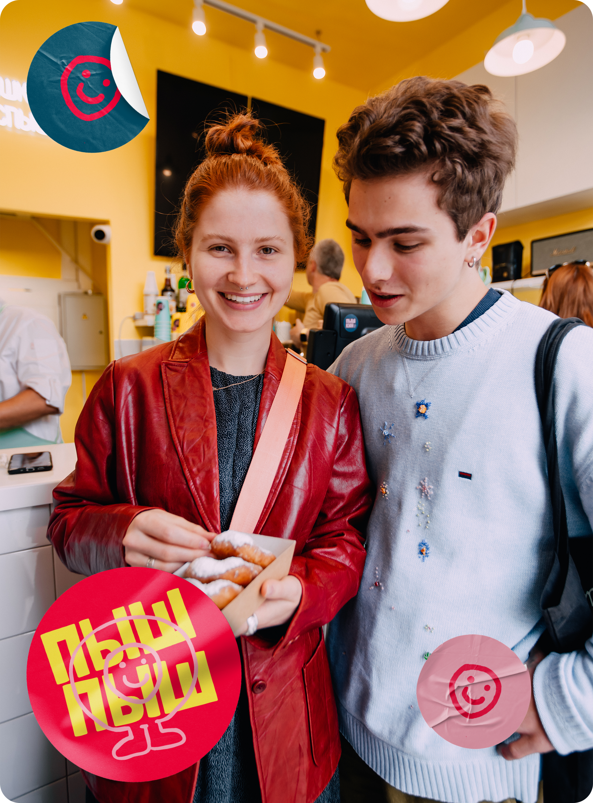
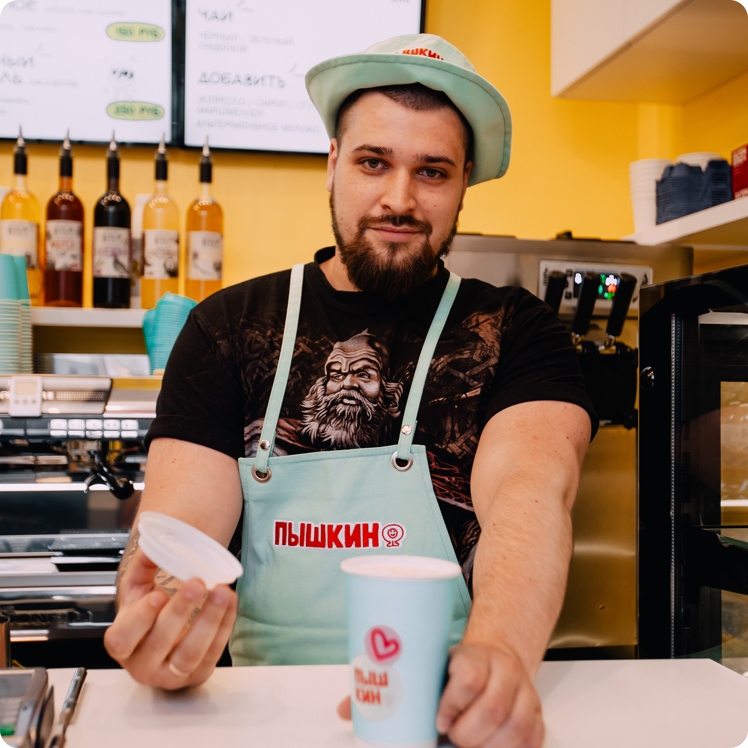
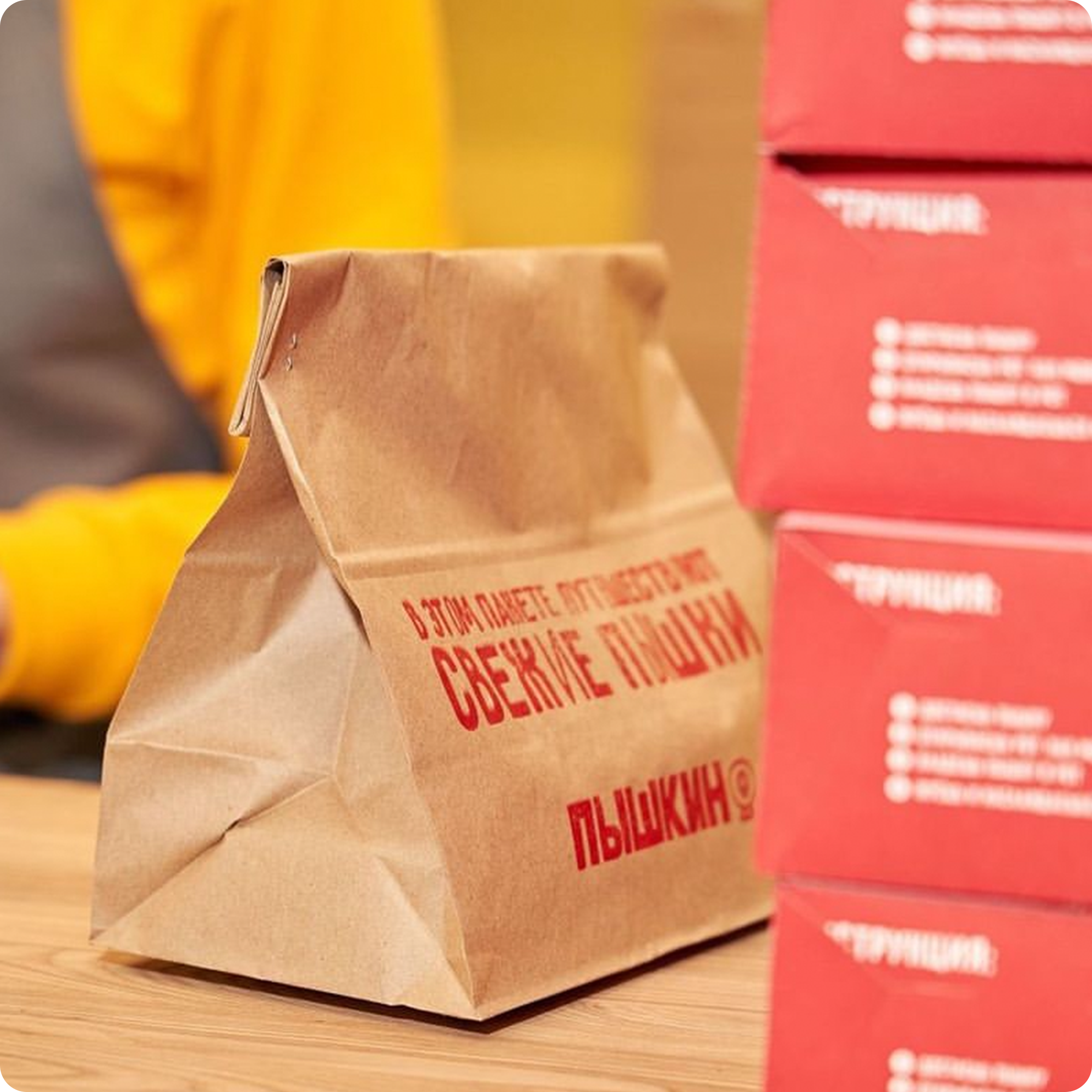
Drawing inspiration from the hues of happiness, Pishkin's color palette features bright and playful tones that evoke feelings of warmth and contentment. From sunny yellows reminiscent of golden mornings to luscious pinks that evoke the sweetness of indulgence, each color is carefully selected to enhance the joyous atmosphere of the café. As patrons step into Pishkin, they are enveloped in a symphony of colors that speak to the heart, inviting them to immerse themselves in a world of whimsy and delight.
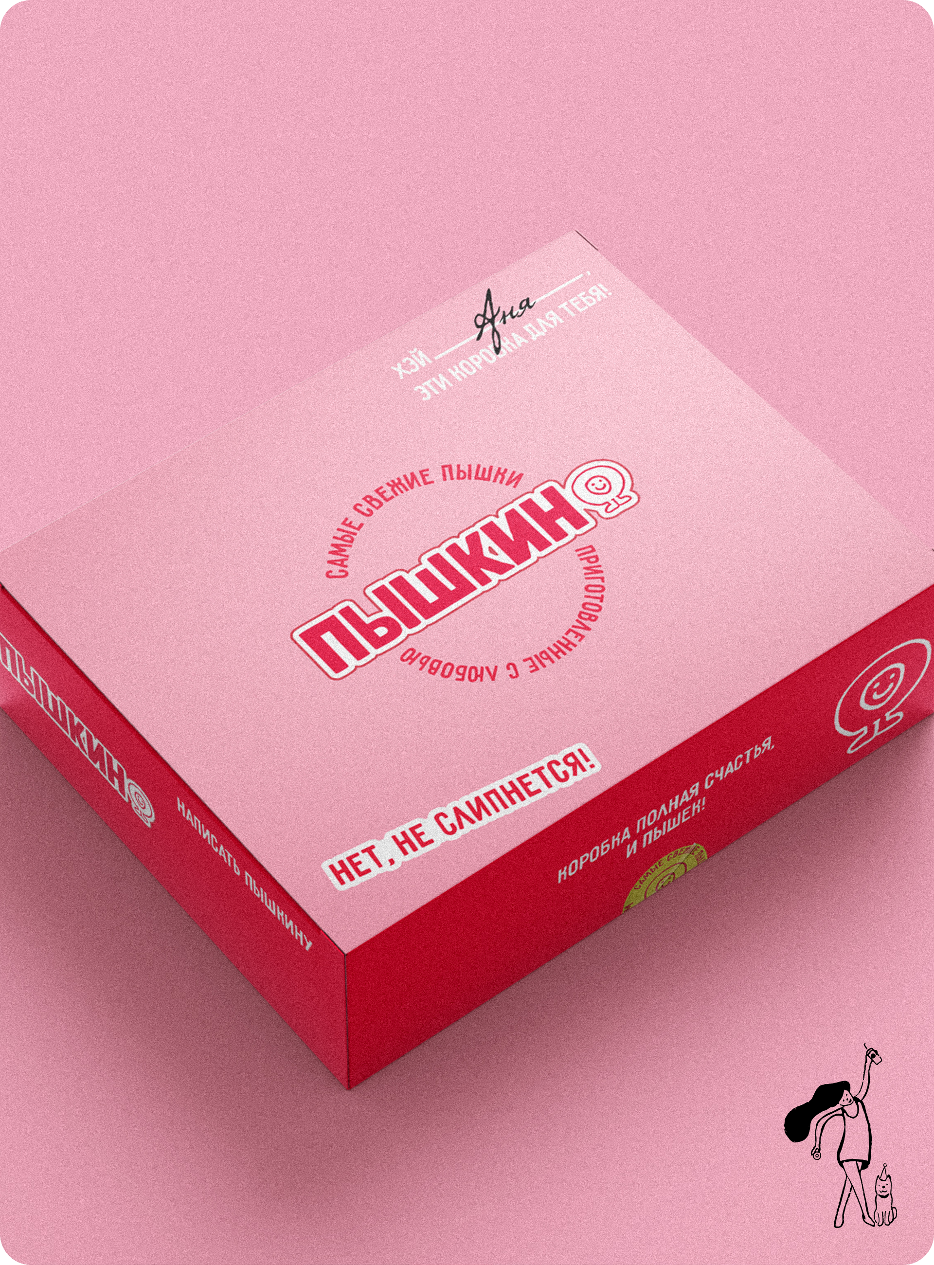
Tasty, vibrant, bold
Vibrant and cheerful visual style reflects playful and welcoming brand spirit. Through lively colors, charismatic typography, and whimsical pet illustrations and photos, brand capture the hearts of pet owners, fostering joy and laughter. This approach communicates our values of love and fun, inviting engagement in a warm and lighthearted manner, strengthening the bond between pets, owners, and brand.

© Dmitrii Misanets
Connect
Privacy Policy